
Share
%201.webp)


By:
Hans Allí

Branding and Web Design: How They Work Together
Your Website Is Your Brand's Digital Home
A brand is more than a logo. It is the complete impression people form about your business: how you look, how you sound, what you promise, and whether the experience lives up to it. For most people, that impression now starts on your website. It is the first place they meet you, and often the place where they decide whether to take you seriously.
When branding and web design are aligned, they reinforce each other. The site looks and sounds like the brand, the brand feels credible because the site delivers, and a visitor moves from curiosity to trust without friction. When they are misaligned, the gap is obvious, even to people who cannot name what is wrong. The logo says premium and the website says template. The tone of the brochure is warm and the site reads like a legal disclaimer. That dissonance quietly costs you.
This article looks at how the two disciplines work together: how brand strategy shapes design decisions, the role of visual identity online, why consistency across touchpoints matters, when a rebrand should trigger a redesign, and how we approach brand-driven web design at Dthree.
Brand Strategy Comes Before Design Decisions
Good web design does not start with colours and fonts. It starts with the questions a brand strategy already answers: Who are you for? What do you stand for? What makes you different, and why should anyone believe it?
Those answers drive real design choices. A consultancy serving established institutions needs a site that signals restraint, precision, and longevity. A youth-focused retail brand needs energy, movement, and personality. Both can be well designed. They should not look the same, because they are not making the same promise.
When we begin a project, we want to understand the brand before we open a design tool. The positioning, the audience, the tone, the proof. Skip that and you get decoration: a site that looks fine in isolation but says nothing specific about the business behind it. Design without strategy is just taste. Design with strategy is communication.
Visual Identity Is How the Brand Is Recognised
Visual identity is the most visible layer of a brand, and online it has to work harder than in print because it carries the experience on its own. Three elements do most of the work.
Colour
Colour sets tone before a single word is read. A consistent, deliberate palette makes a site feel considered and makes the brand recognisable across pages and platforms. The discipline is restraint: a primary colour, an accent for action, and a small set of neutrals will outperform a rainbow of competing tones almost every time. Colour also has a job to do, not just a mood to set. The accent that signals "click here" should not be the same colour as a passive heading.
Typography
Type carries voice. A serif can feel established and editorial; a clean sans can feel modern and direct. The point is fit, not fashion. Type also has to stay readable on a mid-range phone over mobile data, which is how most Philippine audiences will actually read it, so legibility and performance matter as much as character.
Imagery
Photography, illustration, and iconography either reinforce the brand or dilute it. Generic stock imagery signals a generic business. Real photography, a consistent illustration style, or a considered icon set signals a real one. Imagery is also where many brands accidentally break consistency, mixing styles page to page until the site feels assembled rather than designed.
Consistency Across Touchpoints Builds Trust
Your website is rarely the only place a customer meets your brand. There is the logo on an invoice, the tone of a sales email, the look of a social post, the deck a prospect receives, the signage at your office. Each touchpoint either confirms or contradicts the others.
Consistency is what makes a brand feel solid. When the website, the social channels, and the printed material clearly belong to the same organisation, people trust it more, even if they never consciously notice why. When they clash, the opposite happens. The prospect cannot tell which version is the real one, and uncertainty is the enemy of conversion.
This is why a brand system, not just a logo, is worth the investment. Documented colours, type, spacing, and usage rules let everyone who touches the brand stay aligned, so the experience holds together whether someone arrives through search, a referral, or a social link.
When a Rebrand Should Trigger a Website Redesign
A common and expensive mistake is rebranding without updating the website, or updating the website while leaving the brand untouched when it clearly needs work.
If you have invested in a new brand identity, the website is the place it matters most, because it is the most-visited expression of the brand. Rolling out a new logo and palette everywhere except the site leaves your highest-traffic asset contradicting the new direction. The reverse is also true: if the brand itself is dated or unclear, a beautiful new website built on top of it will only present the old confusion more crisply.
A few signs the two have drifted apart:
- The website still uses old logos, colours, or messaging the rest of the business has moved on from.
- The brand has repositioned, but the site still speaks to the old audience or the old offer.
- The visual quality of the site no longer matches the quality of the work or the price point.
- Different pages look like they came from different companies.
When you see these, treat brand and website as one project, not two. If your site is overdue regardless, our guide to the signs your business website needs a redesign is a useful companion read.
How We Approach Brand-Driven Web Design
At Dthree, we treat the website as the working expression of the brand, not a separate deliverable. In practice that means understanding the positioning first, designing the visual system to carry it, and building the site so the experience matches the promise on every screen and every device.
It also means honesty about scope. Sometimes a client needs a full brand and website together. Sometimes the brand is strong and the site simply needs to catch up to it. Sometimes the brand needs work before any redesign is worth doing. Saying which is which, early, saves money and produces better results than forcing one project to do the job of two.
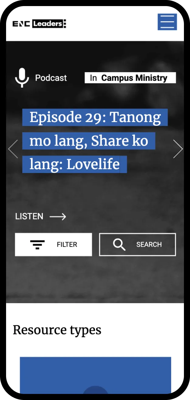
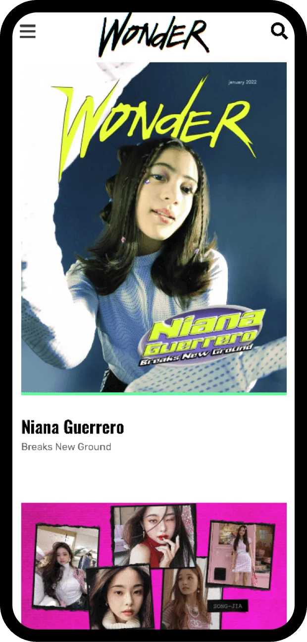
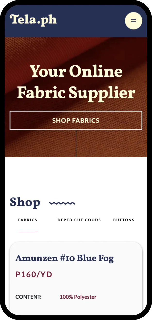
You can see how this plays out across our portfolio, where the design in each project follows the brand and the audience rather than a house style imposed on everyone.
The Bottom Line
Branding and web design are not separate steps that happen to sit near each other. They are two halves of the same thing: the impression your business makes and the experience that has to back it up. Get them working together and the website stops being a brochure and starts being one of the most persuasive assets the brand has.
If your brand and your website have drifted apart, or you are planning both at once, we would be glad to help you think it through. Get in touch and let's look at where the two should meet.
.avif)